Template Re-design on Information Architecture
DB Detail
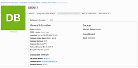
Oracle had 7 types of Cloud DB services in 2020. Each DB instance page within a service has an information section where it shows the configuration detail. As there is not much guideline on what and when a type of configuration metadata should be displayed, the section got overloaded overtime, which creates several usability issues.
I was asked by my design manager to make an improvement of this section, and create a design template that can be applied to all DB instance page.
Company/
Oracle
Role /
UX/UI Designer
Collaboration /
Designers, PMs
Year /
Aug, 2020- Oct, 2020
Problem Statement
Information Section is Overloaded
Comparing 7 DB detail pages in one place , a few problems becomes apparent:
-
It's true with what’s mentioned by a few stakeholders, that it can be hard to find a particular configuration when the list is long.
-
When information section is too long, it creates another usability issue: resources navigation and listing is not visible to users without scrolling.

Autonomous Database Dedicated (ADB-D)


Autonomous Database Share (ADB-S)
Virtual Machine Database

Bare Metal Database

Exadata Cloud Service Database

Exadata Cloud@Customer DB

Autonomous Exadata Cloud@Customer DB
In order to make the list shorter, I need to know how frequently each piece of information is used. It became clear to me that this is a design project on information architecture.
To know what should be prioritized and create the proper information architecture, the first approach that came to my mind is user research.
User Research
DBAs Don't Manage Resources at DB Instance Level
I talked to 3 internal users who are database admins. To my surprise, DBAs in general do not go into detail page as they have hundreds of databases to manage. They will only go in there and check if there’s something wrong with that database.
My attempt of trying to probe by asking what works and doesn’t work in current design did not go to the direction that I was expecting. When asked how satisfied they are with the information section, their feedback is generally positive, or in another word, this is not their topmost concern.
Participants shared a few features they want, such as wanting to have a fleet view, being able to do operations in bulk. Beside this, there are some findings that shed light on design:
Center info for primary actions
Maintenance, backups, monitoring metrics are common DBA operations, so the related information is expected to show in obvious place.
Want to know what's actionable
Want to be notified if certain settings need attention, and be informed with what action to take.
Need consistency across services
It’d be better if metadata name and order could be consistent across services
Some information or feature is barely used
Character set and tagging are barely used
Content Inventory and Auditing
Since the feedback on the metadata section is not as much as I expected, I decided to try a couple of other activities, first one is content inventory and auditing.
I first made sure I had every piece of metadata from all 7 db services in the console, transferring this information from screenshot to a list and put them together in one page. This exercise allows to me get the breadth and depth of the content from each service, and it shows what is inconsistent across services.

By making an inventory of them, I also noticed there are some metadata that are common across all services. To pinpoint them, I made another list.
This list shows there's 7 metadata that's common across all 7 db services, and I categorize them as the essential ones.

Card Sorting with Domain Experts
To know what are the additional sections other than essential ones, I did 1-1 card sorting exercise on ADB-D service with 4 PMs, with the goal to figure out what metadata should be grouped together and how do we name it to best summarize each section. Self-explanatory names can act as index for users when they need to find a particular metadata.

The common sections found from this exercise are color coded. They are:
-
General information
-
Network
-
Backup
-
Tertiary information (information that can be hidden or considered shouldn't be in the page)
My Card Sorting
However, metadata under each section do vary from one person to another. I then cross compare it with results from content inventory and audit, and did a round of card sorting exercise on my own. Here’s what I come up with:

I shared this list in internal design critique to get feedback, did a few tweaks based on feedback.
I was also suggested against making radical layout change, and to utilize existing component so there’s higher chance for it to get implemented.
Design
Final Design

Fixed section with common metadata across all 7 DB services

Users can only click to view more metadata when it requires attention

Using a progressive disclosure approach, metadata is separated in groups
Once drilled down, visual cues show on specific setting so user can take actions on it
Result
This design wasn't implemented within DB service. However, I presented research findings and final design to director and a few senior members from OCI central design team. It was well-received. Since they are working on updating patterns to evolve to a new design system Redwood, and the team is short staffed with amount of work they have.
The research and design explorations are particularly insightful to the central team. Later when resource detail page template was revamped to Redwood theme, this design was incorporated in their latest release.
