Refresh a DB Performance Report Template
AWR Report
Automatic Workload Repository (AWR) report is a one- page performance report for Oracle databases. It collects and stores performance statistics for problem detection and self-tuning. AWR is used by a broad audience both internally and externally. However, it hasn’t gotten any design love since it was first released in early 2000. Our VP asked for a refresh.
Company/
Oracle
Role /
UX/UI Designer
Collaboration /
PM, Designer
Year /
Jul, 2023- Sept, 2023

Problem
Modern AWR, What Does it Mean?
Me and the other designer in the team were tasked to refresh this report. However, our VP left it open for us to define what the next-gen AWR should look like .
Our first step with this project is to conduct foundational research and make our own definition on a modernized AWR report.
Information Gathering
Getting the Basics
Before user research, we collected some information from our VP and supporting team.
What are AWRs?
We were shared with a bundle of AWR reports. Turned out there are more than one types of AWR reports.
Each team at Oracle focuses on using different types of AWR reports. These reports' formats are similar, but data generated varies from one report type to another.

Who are the report users?
Internal: Domain Experts
Internally, this report is used by various teams, including bug diagnosis for customer support, performance analysis and feature testings.
External: DBAs
Customer can download this report from OCI console to do self diagnosis, or pass it down to Oracle support team to identify bugs.
User Research
User Research
More Things to Know
This poses a design challenge, how do we modernize the report in a way that it can be applied to a variety of reports used by different audience?
To tackle this, I identified a few things with the other design to investigate.
Know More About AWR Reports and Users
What are the teams using AWR report?
How many types of AWR reports are there?
Which team manages the data generation?
Understand User Journey
How is AWR used?
Is there any common user journey, or common section that’s consistently shown in all types of report.
Discover Design Opportunities
What’s working and what’s not working with the current report?
Findings
We talked to 5 internal AWR users, each from different team. A round of affinity diagraming leads to the following findings.


More About AWR Reports and Users
User Journey
Internal domain experts typically have an idea of what they're looking for. They look at key metrics under report summary, then depending on their focus, they will go to sections like wait events, Exadata, or SQL to branch down.

Design Opportunities
😃 What’s working?
Quality of data is good so far
-
Quality of data = data users needed to identify a root cause of a problem is available in the report.
-
There is more data in the report than needed for any given problem, but it’s preferred that way as each problem being solved requires different data.
-
AWR data is iterative and keeps expanding each release, internal users also have channels to give feedback and add data in the report.


😞 What’s not working?
Presentation is secondary, but there's a lot to improve
-
Users would like better navigation and readability.
-
Wish there's a way to trim down noise once user got an area of focus. User only look at a small section or certain metrics once the issue is identified. With the current report, they rely on other tools to copy/paste related data and put them together, or they go back and forth to cross reference.

Design
Design
Information Architecture (IA)
Amount of data has grown over time, but in a way that looks like things being simply piled up on top of each other.Its information architecture reflected this.
The first thing we did is to understand the existing IA so we can come up with a solution to re-organize information for better navigation.

Intro section: gives context of the environment
Report summary: key metrics
Report index: index is in between the context which is a big usability issue
Content: tremendous number of tables and content
L1 navigation
L2 navigation
IA

Index (anchor links)

.
.
.
.
.
.

From IA to Design
The existing report has 5 levels of navigation.
L0- (eg.) Main Report
L1- (eg.) Report Summary
L2- (eg.) Load Profile
L3- (eg.) Exadata outlier summary
L4- (eg.) Cell level
In design, the L4 level is not shown in the index as this is too granular.
Content in the Report
Today, data in AWR are in grid and raw text format.
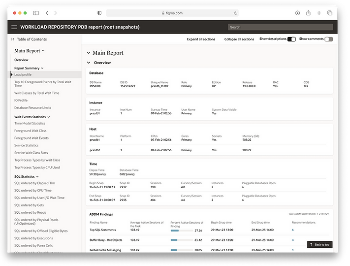
In this wireframe, we defined the boundary and put related sections together so the IA aligns with the index.

Define Component Behavior
To improve readability and make sure it's scalable, guideline and behavior of the component and defined.
The grid component is from Oracle's redwood design library. A few customization is made so that it's compact, readable, and it can be scaled throughout the report.


Additional Features- Comments
Users today already use email or txt file to document their findings and share with their co-workers or customers.
We added this built in comment feature, which allows for a quick navigation between related info, trim down noise, and great increate productivity.

Final Design
